
Cards
Add, configure, and arrange the bento cards shown on your profile grid
Cards
Add, arrange via drag-and-drop, and configure modular cards under Cards ↗.
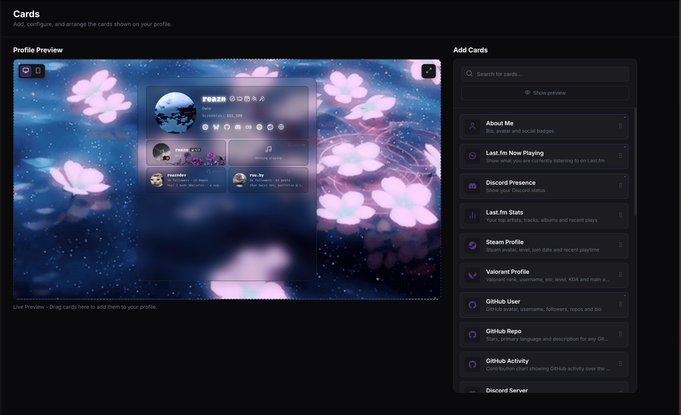
Add and configure a card
Add a card
Open Settings => Cards, click Add Cards, and choose a card type from the available categories.
Place and resize it
Drag the card into the bento grid. Use the card's resize controls to choose a supported size.
Configure the card
Select the card to open its settings panel. Enter usernames, URLs, labels, or display options required by that card.
Refresh external data
For cards with a fetch action, use it after changing the account or identifier. The live preview updates as the card configuration changes.
Save the page
Click Save to publish card configuration, layout, and profile changes.
The grid
Your profile uses a responsive bento grid. You can design the page visually:
- Move cards — Drag a card to an empty position in the editor grid.
- Resize cards — Use the resize controls to stretch a card across its supported columns or rows.
- Style cards — Adjust card-level background, opacity, and corner-radius overrides when the selected card exposes those options.
Profile Pages (Premium)
Premium profiles can add up to five named pages. Each page has its own card grid. Manage pages from the Cards settings tab:
Add
Create a named page such as Projects, Music, or Links.
Rename
Change the selected page name, up to 32 characters.
Reorder
Move a page left or right in the visitor-facing tab order.
Delete
Remove a page other than Main and its page-specific cards.
Visitors switch pages from the tabs above your profile content. A page can be shared directly with
a readable URL such as /your-username/projects. If Premium access ends, Dajia keeps
the pages and cards stored but shows only Main publicly until Premium is restored.
Size system
Different cards support different sizes on your grid:
| Size | Grid dimension | Typical use |
|---|---|---|
s | 1x1 | A square block for a single stat, profile picture, or short text. |
st | 1x2 | A vertical block for taller content such as activity lists. |
m | 2x2 | A larger block for detailed profiles or two-column content. |
l | 2x3 | A wide block for showcase features or large stats. |
Not every card supports every size. The card search and the individual card guides show the available layouts.