
General Styling
Change your profile background, colors, container, and card look
General Styling
Use General Styling ↗ to shape the overall look of your profile. This is where you set the mood of the page with your background, container, card style, and colors.
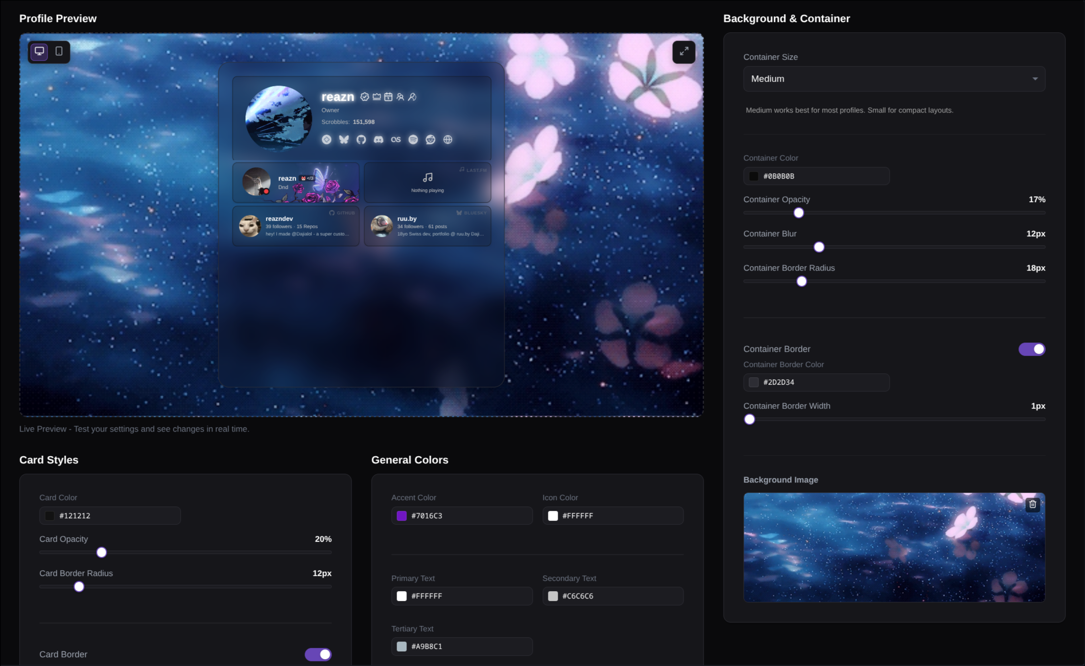
The preview updates as you change things, so you can experiment before you save.
What you can change
Background & Container
Choose a background image and control the main profile panel.
Card Styles
Set the default look of the cards inside your profile.
General Colors
Pick your accent, icon, and text colors.
Live Preview
See the result immediately while you adjust each setting.
A simple way to style your profile
Start with the background
Click the Background Image area to choose or upload an image. This becomes the visual base of your page, so it is the best place to start.
Adjust the container
Use Container Size, Container Color, Opacity, Blur, and Border Radius to shape the main panel that sits on top of the background.
- Use a higher opacity if the background is busy
- Add blur for a softer glass effect
- Turn on the border if you want the profile area to stand out more
Style your cards
Set the default card look with Card Color, Card Opacity, Card Border Radius, and Card Border.
This helps all of your cards feel consistent without changing them one by one.
Finish with your colors
Choose an Accent Color for highlights, an Icon Color, and your Primary, Secondary, and Tertiary text colors.
If text is hard to read, increase the contrast between your text, cards, and background.
Style by area
This section shapes the large panel that sits on top of your background and holds your cards.
Size & Shape
Use Container Size and Border Radius to make the profile feel wider, tighter, sharper, or softer.
Depth & Focus
Use Color, Opacity, and Blur to decide how much the background shows through and how glassy the panel feels.
Border
Turn the border on if you want the main profile area to stand out more clearly from the background.
If your background is detailed or bright, raise the container opacity a little and add some blur. That usually makes the whole profile easier to read.
Background image
Click the background preview to choose an image. It appears behind your profile in the live preview right away, so you can instantly see whether it feels soft, bold, busy, or calm.
To remove it, click the trash icon on the image preview.
This section sets the default look for the cards inside your profile.
Card Color
Choose the base color your cards sit on. Darker cards usually feel cleaner on busy backgrounds.
Card Opacity
Make cards feel lighter and more blended, or stronger and easier to separate from the background.
Corners & Border
Use border radius and border settings to make every card feel softer, sharper, cleaner, or more framed.
If you want the whole page to feel polished quickly, start here. Matching card styles do a lot of the visual work for you.
This section controls the colors used across your text, icons, and highlights.
Accent Color
Used for highlights and small details. This is the color that gives your profile its strongest visual identity.
Icon Color
Changes the look of icons across the profile so they blend in cleanly or stand out more.
Text Colors
Primary text is for the most important content, secondary text supports it, and tertiary text is best for softer details.
If the page feels hard to read, do not just brighten the text. Check the contrast between your text, card color, and background together.